Color is everywhere. We know that the sky is blue and the grass is green, but we might not stop to reflect on the power that color has on the human mind.
Colors are communicative tools that can evoke emotion, illicit behavior, and cause physiological reactions. This is why we encounter such a wide variety of color schemes in the businesses around us. The right selection of colors in a logo can make or break a brand, and a solid grasp of color theory and logo psychology can translate into major success for your business.
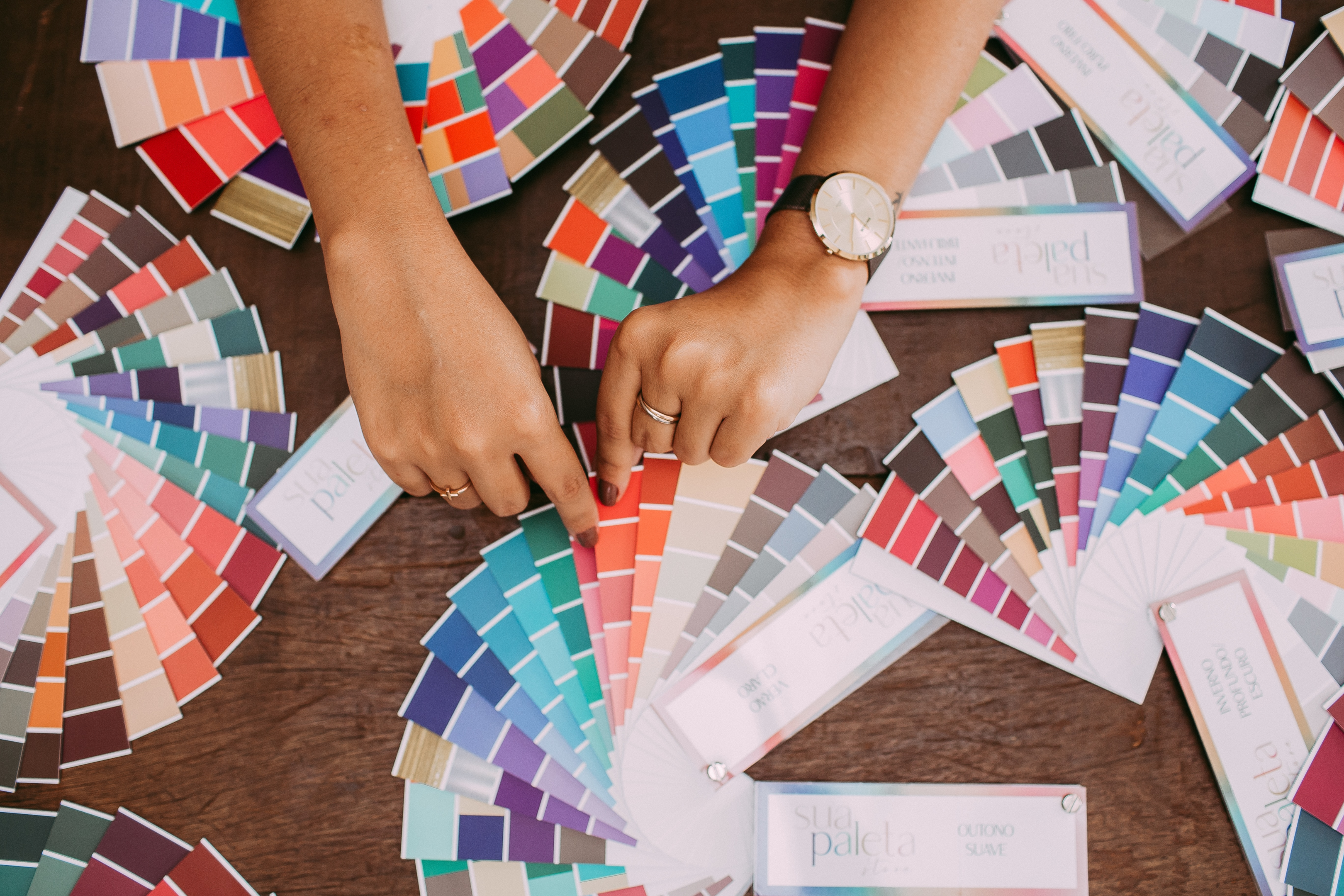
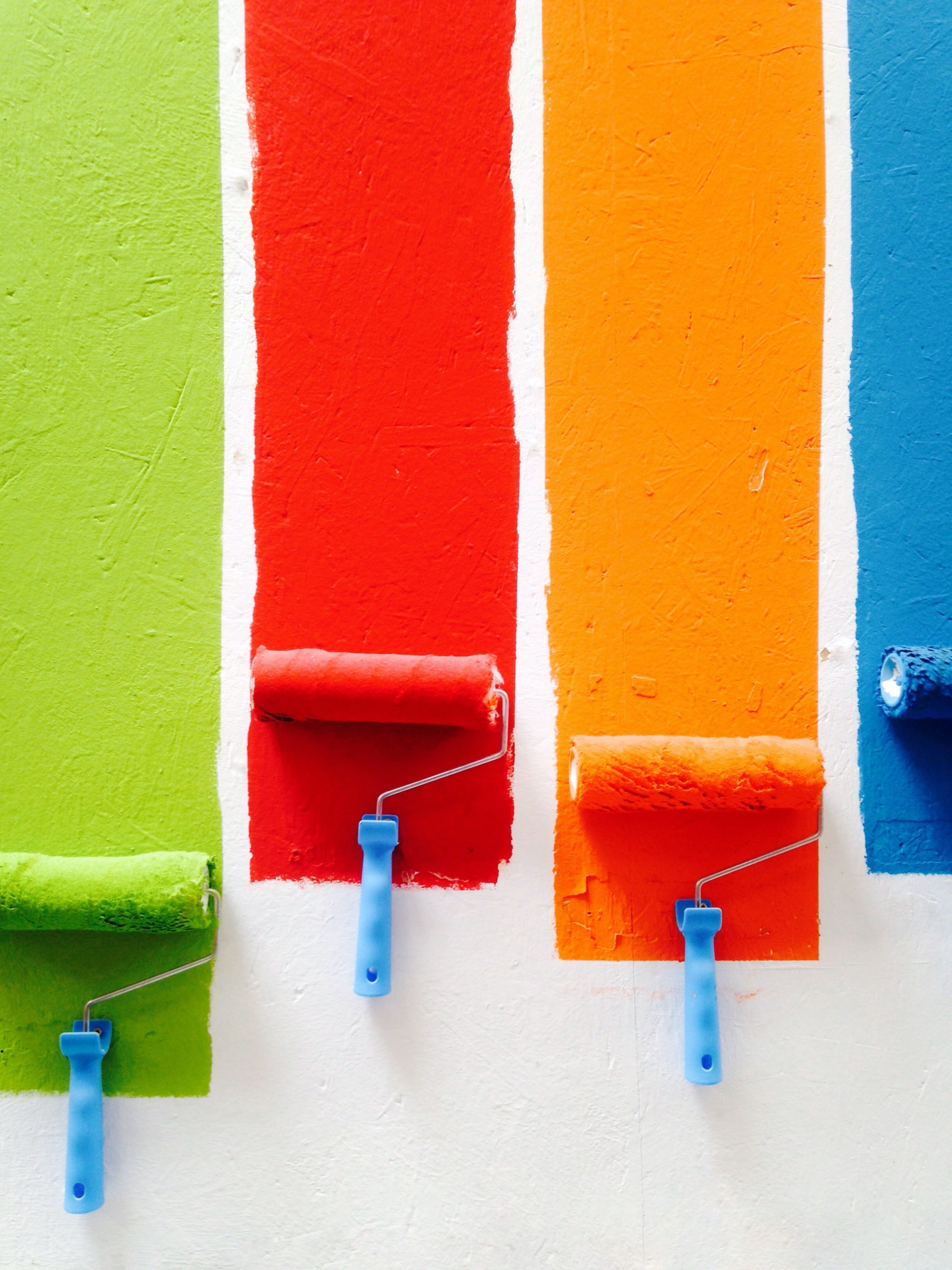
The color wheel full of seemingly endless options for your brand logo can be a little daunting, but an understanding of the meaning of colors and the considerations behind them simplifies the selection process.

Why Is Logo Color Important?
Logo color is important for brand recognition, associations, and reputation. Your logo is one of the first impressions you can make on a potential consumer and selecting the right colors gives you significant power over that impression.
Selecting your brand color is the equivalent of choosing the emotions and associations you hope to evoke in your audience. The right color choice can elicit a desired behavior, while the wrong one may harm your brand image.
Where the Meanings of Logo Colors Come From
Logo color meanings are deeply rooted in color psychology. Studies in the discipline show that hues are a determinant of human behavior, making color an excellent tool for marketing and advertising.
Our brains have varying cognitive, emotional, and physical reactions to the colors that meet our eyes. However, how color influences a consumer differs depending on demographics such as age, gender, and culture.
Color Association
Each color has the ability to be immediately associated with an emotion or concept. For example, using red in your logo design is not a mere aesthetic choice, but can also signal love or romance.
Be sure to decide what emotions you wish to evoke and select brand colors accordingly.

Environment/Region
Color symbolism can vary depending on the environment and region of your target audience. When choosing logo colors, be mindful of the potential implications in your target region to avoid offending a potential consumer.
Colors with positive connotations in one region may be interpreted negatively in another. For a global audience, blue is commonly used given its lack of significant negative connotations.
Culture
Different cultures possess various understandings of logo colors. Western cultures often vary significantly from Eastern cultures in color interpretation.
Religion is another important factor, as different religions hold different colors as either sacred or forbidden.
Color Meanings in Logos
When selecting the right color for your logo, it is crucial to be mindful of the symbolism and associations behind each option. This is your chance to exert some power over how your consumers feel about your brand.
Here are logo color meanings for commonly used colors and examples of logos using each:
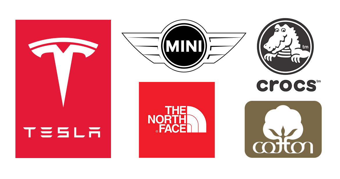
1. Red Color Meaning
The color red is popular in branding, most especially when you want your brand to have youthful energy or be loud and playful. It provides an energetic punch and may be avoided for more understated brands. Red’s color associations include romance, warmth, and love.
Red logos may work best for restaurants, as studies indicate warm colors increase heart rate and hunger.

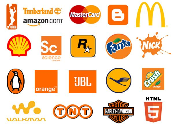
2. Orange Color Meaning
Orange is another color that is typically seen as playful and energetic but in a less aggressive way than red.
Orange logos are known to invite a call to action, as well as promote feelings of energy, prosperity, and change. However, it should be avoided for serious and luxury brands.
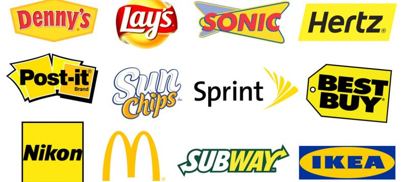
3. Yellow Color Meaning
The color yellow symbolizes friendliness, happiness, and positivity.
Consumers may associate yellow logos with sunshine, affordability, and youth. Yellow, however, is not often linked with maturity and would likely best suit a young target audience.
4. Green Color Meaning
Green symbolism most commonly includes nature, health, and harmony.
Since it has strong cultural associations with the natural world, green logos would be best employed by vegan, natural wellness, and eco-friendly brands. It is also known to be a restful color that is not too bold or forceful to the eye.

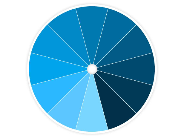
5. Blue Color Meaning
Blue logos inspire calmness, trust, and healing. People often associate the color blue with loyalty, respectability, and wisdom.
Healthcare and medical brands may employ it to offer a sense of calm and spiritual awareness to potential patients, while corporate brands may utilize navy blue to evoke professionalism.

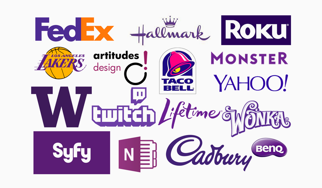
6. Purple Color Meaning
For luxury brands, purple logos are the best choice. Purple has been historically associated with luxury, wealth, and high quality.
It is ideal for cosmetics and high-end retail companies, while it may not work well for a company employing a down-to-earth appeal.
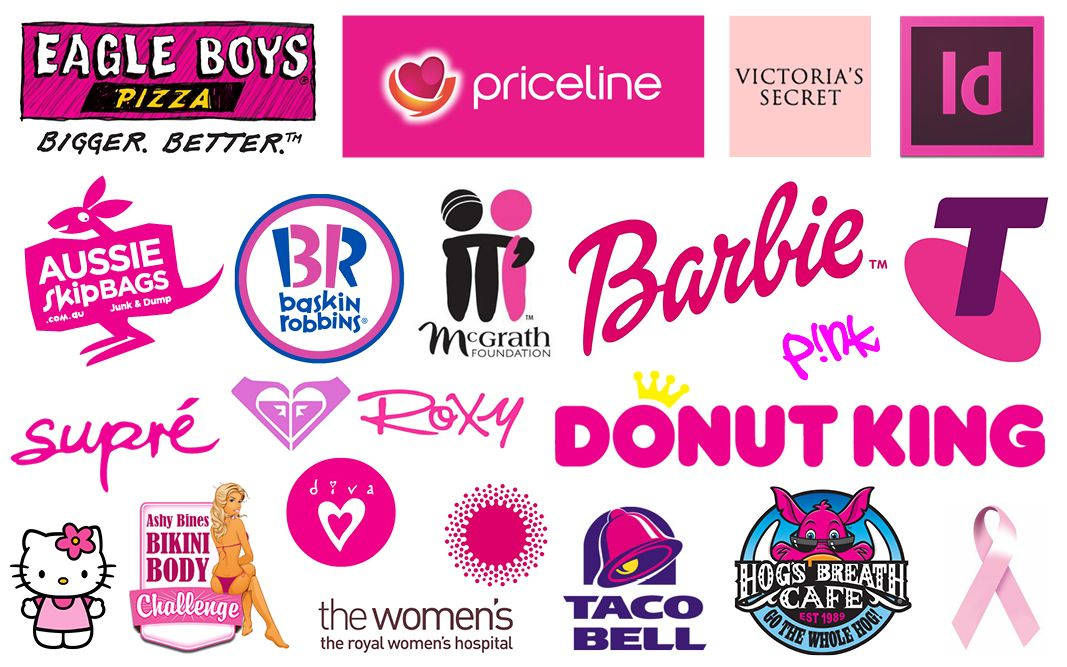
7. Pink Color Meaning
Pink is deeply associated with femininity and modernity. Given its position as a feminine color, a pink logo would be most successful for a brand targeting women.
However, it is also quite versatile and can be used in varying light or dark shades. Soft pink logos may appear luxurious, while neon pink may appear very modern.
8. White Color Meaning
White can be a strong color for a business and come across as careful, and spotless. A brand that wishes to be seen as methodical or representative of purity should utilize the color.
However, white logos are often paired with another dominating color as a background so as to avoid getting lost.
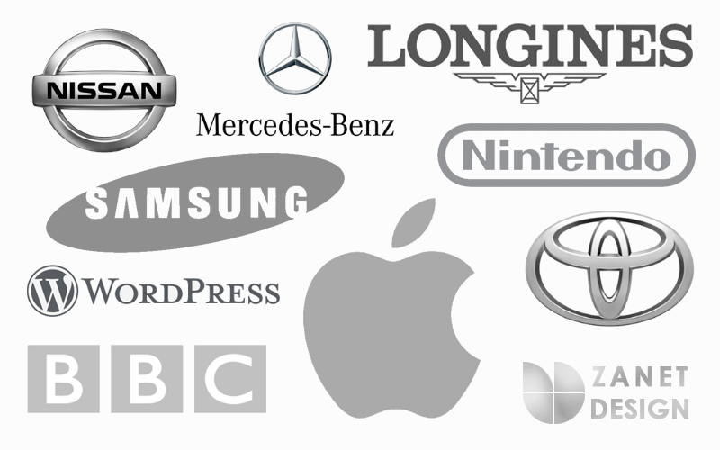
9. Gray Color Meaning
Gray logos are the middle ground between black and white choices. Gray is softer than the alternatives, giving it a more muted, serious, and classic feeling.
The neutrality of gray offers a timeless and unbiased option. Common associations for gray include practicality and efficiency.
Famous brands like Apple have been extremely successful with this color choice.
10. Black Color Meaning
Black logos are most commonly used to evoke feelings of authority, respectability, and exclusiveness. The color black symbolizes power, strength, and mystery.
The bold absence of color will make a brand look modern and luxurious. For affordable brands, this logo color should be avoided.

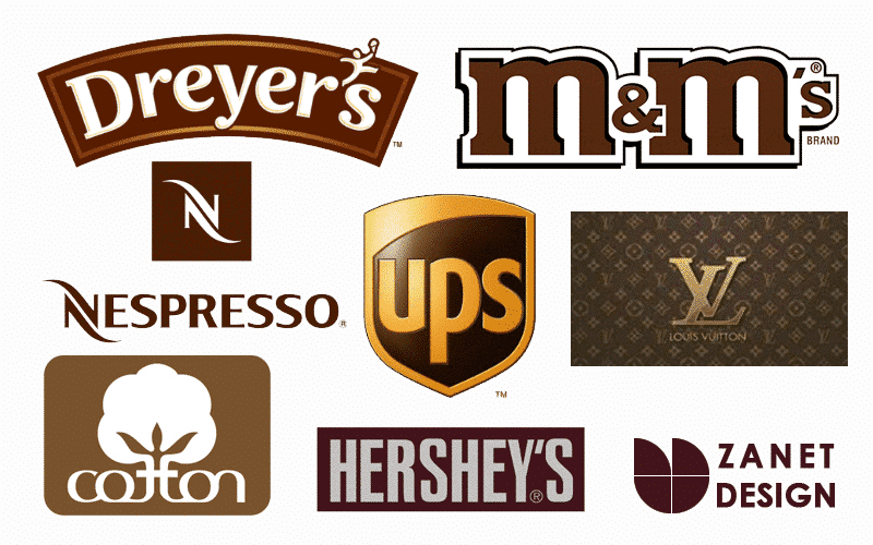
11. Brown Color Meaning
A brown logo will help your brand to come across as grounded and serious. It is less vibrant than other more playful colors and is very earthy in tone.
The color brown is associated with nature, reliability, and security. It is also the least used logo color, so it may stand out among competitors.
Logo Color Combinations
Does combining colors change the meaning of your logo? The short answer is yes – multiple colors will certainly convey different meanings and must be carefully combined.
It is also a general rule of thumb to avoid more than 3 colors in your logo design. One function of a logo color is brand recognition and both simplicity and consistency are essential to achieve that.
Combining Logo Colors
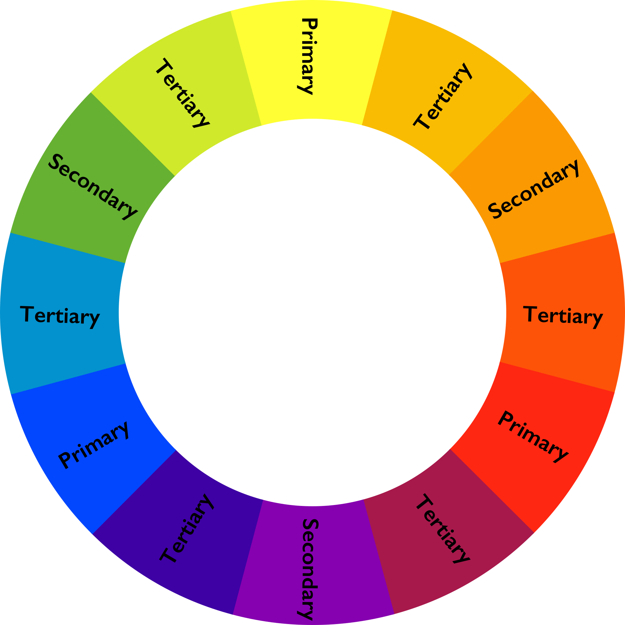
There are many ways to combine your logo colors and they all depend on one essential tool: the color wheel.
One option is a monochromatic scheme, which can include employing just one color alone, different shades of the same color, or black-and-white.
A monochromatic scheme can simplify logo usage in non-conventional ways such as embroidery, engravings, and textile printing.
Another option is an analogous color scheme. Analogous colors are groups of colors found next to each other on the color wheel.
A logo using this combination would include a base primary or secondary color and a supporting secondary or tertiary color.
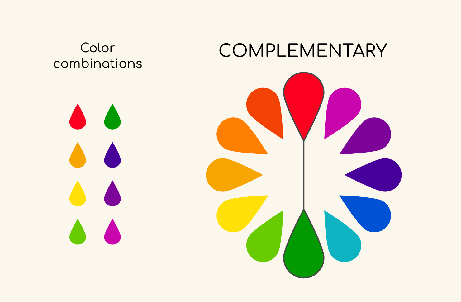
Your brand can also use a complementary color scheme, which includes pairing colors from opposite sides of the color wheel to create a high-contrast logo that really pops.
For example, red and green complement one another and face one another on the color wheel.
A triadic color scheme works similarly, utilizing three colors evenly spaced out on the wheel, such as the primary colors red, yellow, and blue.
Brand logos may even use tetradic color schemes, which can also be referred to as double complementary. This includes four colors divided evenly around the wheel, in which no color is clearly dominant.
Logo Color Considerations
Aesthetics
Although color symbolism is important to consider in the logo design process, the aesthetics of your logo colors are essential as well. You may have landed on the perfect symbolism, but the colors should also work together visually.
Consumers are more likely to enjoy and buy from a brand with color combinations that are pleasing to the eye. Put yourself in the shoes of your ideal consumer and make color choices you think they will find most appealing.
Color Psychology
As mentioned above, each color evokes a significant response in your audience. Color psychology tells us that colors can signal action, influence mood, and even cause physiological reactions such as increased blood pressure or eyestrain.
When picking logo colors, aim for the best consumer experience. Leave your audience motivated to consume your product or service, pleased and void of negative physical symptoms.
Perception/Significance
When considering the combination of colors that will make up your brand logo, imagine the way in which a consumer will perceive those colors.
Warm colors, such as red, orange, and yellow, are seen as happy and welcoming, while cool colors like blue, green, and purple can have a calming effect and are often associated with nature.
Using a combination of warm and cool colors may be confusing and should be done with good reason. Also be mindful of which logo color combinations will be perceived as bold, and which as tame, and decide what message is best to send for your brand.
CMYK & RGB
CMYK and RGB are modes for mixing color in graphic design and will come into play during the logo design process.
RGB (Red, Green, and Blue) works best for digital work and screen display, such as website graphics, online ads, and social media posts.
A graphic designer manipulates these colors to create the desired pigment with elements such as shading, vibrancy, and saturation in a process called additive mixing.
CMYK (Cyan, Magenta, Yellow, Key/Black) is used for printed materials such as business cards, billboards, or merchandise. Layers of physical ink reduce brightness to obtain the desired color in a process called subtractive mixing.
Formatting
These modes also play a role in the formatting of your logo.
For RGB files, you will want to use JPEGs, PSDs, PNGs, or GIFs for best results.
While for CMYK files, PDFs, AI, and EPS are typically ideal.
If you are working with a printer, you can determine which file format they favor.
Differentiation
When selecting the colors for your logo, be mindful of your competitors and their logo choices. You want your logo to enable your brand to stand out and be instantly recognizable.
Try to stay away from cliche, and overused color combinations when you can, and think outside of the box. Feel free to experiment with uncommon logo coloring as long as the color symbolism is well-researched.

How To Choose the Right Logo Colors for Your Business
Each business will excel with different logo color choices based on their target audiences. For example, an economical, affordable-for-all brand logo will not want to appear exclusive and luxurious with purple or black coloring the same way a high-end fashion brand’s logo will.
Here are some steps to determine what colors work best for your business:
Conduct Market Research
Market research can ensure the colors you select are being received by your intended audience in the positive ways you had hoped for.
Understanding the demographics and psychographics of your audience can verify that you are sensitive to the cultural traditions and perceptions they may have of a color.
You can also use psychological and psychophysiological research techniques to test emotional responses and visual retention to ensure the success of your logo.
Select a Logo Format/Style
Before beginning to select the color of your brand logo, you will want to finalize the format and style of the logo itself. A logo can entail an emblem, pictorial mark, wordmark, monogram, or mascot. Have confidence in this design before beginning to color it.
Pick a Color Scheme for Logo
Finally, you will want to land on a color scheme for your brand and its logo. Whether it is monochromatic, analogous, complementary, triadic, or tetradic, ensure it is consistent throughout all of your branding and logo use for recognizability.
Here are some steps to picking and creating the perfect color scheme and logo design:
- Leverage any natural inspiration or associations with your brand. For example, if most of your products are a certain color, you may lean into that for your branding. If your brand has ties to the ocean, you may utilize blue color combinations.
- Set a mood for the color scheme and select colors that best represent it. Select colors with meanings relevant to one another.
- Consider the context of each color and steer clear of complicated cultural or regional implications of your target audience.
- Make frequent references to color theory and a color wheel.
- Draft many designs and test the effectiveness of each.

Meaning of Colors FAQs
What Is the Best Color for a Logo?
There is no single best color for a logo given how different businesses and their target audiences are. Blue is the most popular color for brands worldwide, but the best color is one that evokes a positive and relevant response for your specific brand.
Do Logo Colors Really Matter?
Yes! Carefully selecting the colors in your logo allow you to connect with consumers on a deeper psychological level.
It also gives you more control over what your audience associates your brand with and feels when they see your branding.
It has also been reported that an overwhelming majority of customers identify color as a primary reason for choosing one brand over another.
What Colors Shouldn’t I Use on My Logo?
Colors to avoid are dependent on your intended target audience.
For example, you may not want to use the more femininely associated color of pink for a male sports brand.
However, some general rules are to avoid too many colors, and colors that prohibit visibility, such as light colors on light backgrounds
The Bottom Line on Logo Color Meanings
Selecting the colors for your brand logo is not random or based on aesthetics alone. Color psychology demonstrates that each color holds a heavy meaning that will vary among different demographics.
The perfect logo is one that is well-thought-out with your brand identity and target audience in mind.
Want to work with an expert to select your brand’s color palette? Schedule a no-commitment consultation with Studio Lyn to start the branding process.