Each and every day, consumers are flooded with written content. Emails, flyers, blogs, and social media posts all compete furiously for the attention of the busy reader.
So, what attracts a consumer to you? How can your brand’s content stand out as the worthiest? What someone clicks on, scrolls past, or keeps reading is largely dependent on the font it is presented in.
Excellent copywriting is key, but the careful crafting of your content cannot stop there. The typeface you select for your brand is just as important as what you have to say. Fonts can enhance the attention your content receives, its readability, and your brand’s storytelling.
Font psychology tells us that different fonts evoke different thoughts and emotions in audiences and can even make statements about your company’s history and attitude.
Therefore, it is vital your brand employs the perfect font combination. The right font can ensure it is your email, flyer, or post that gets a consumer’s time.
Powerful Fonts – What are They?
A powerful font is one that tells your ideal and unique story, is eye-catching, and achieves the maximum impact for your branding.
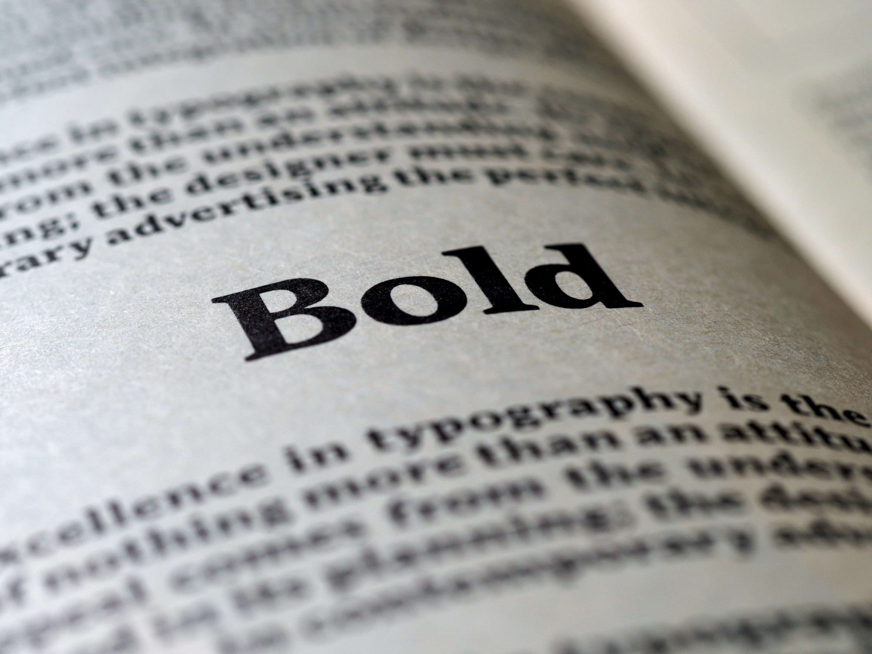
Slab serif fonts are one of the best to incorporate into your company’s content. Serifs are the small lines attached to letters that are present in many fonts. A font without these lines is called a sans-serif typeface. Slab serifs strike a balance between the two typefaces as they are close to sans serifs in their construction.
Subtle details like serifs can sway your reader’s opinions and impressions of your brand. Serif font styles typically look authoritative and suggest experience.
For example, Times New Roman resembles the old style of typewriters and is an excellent example of a serif typeface with these implications.
Beyond aesthetics, serifs serve as functional fonts for body copy as they are more legible at smaller scales. They allow for a flow in reading that maintains a potential consumer’s attention.
What Makes an Impactful Font
Typography gives you control over the unique look and impression of your brand. In your copy, social media content, and logo design, you want to select a font that is impactful for the most success.
To be impactful, a font should be brand-appropriate, well-crafted, and visually appealing. Here are some of the considerations in selecting the fonts perfectly suited for your brand:
Evoke Emotion
Believe it or not, the fonts we encounter online affect our emotions.
It is easiest to think of fonts in the same way we understand and respond to verbal inflections. A consumer may read the same word and comprehend its meaning differently dependent upon the typeface.
For example, an elegant script comes across as gentle and soft. While a thick font is loud and exciting.
Fonts can often be divided into categories based on the feelings associated with them. Some are personal, such as ones that look handwritten and have imperfections. Others are welcoming, bold or childlike.
Balance
Balance in a font has to do with the height and width of the characters and how proportionate they are to one another. A balanced font does not appear top-heavy and has appropriate negative space.
If a font is imbalanced, it may be confusing, irritating, or uncomfortable to read.
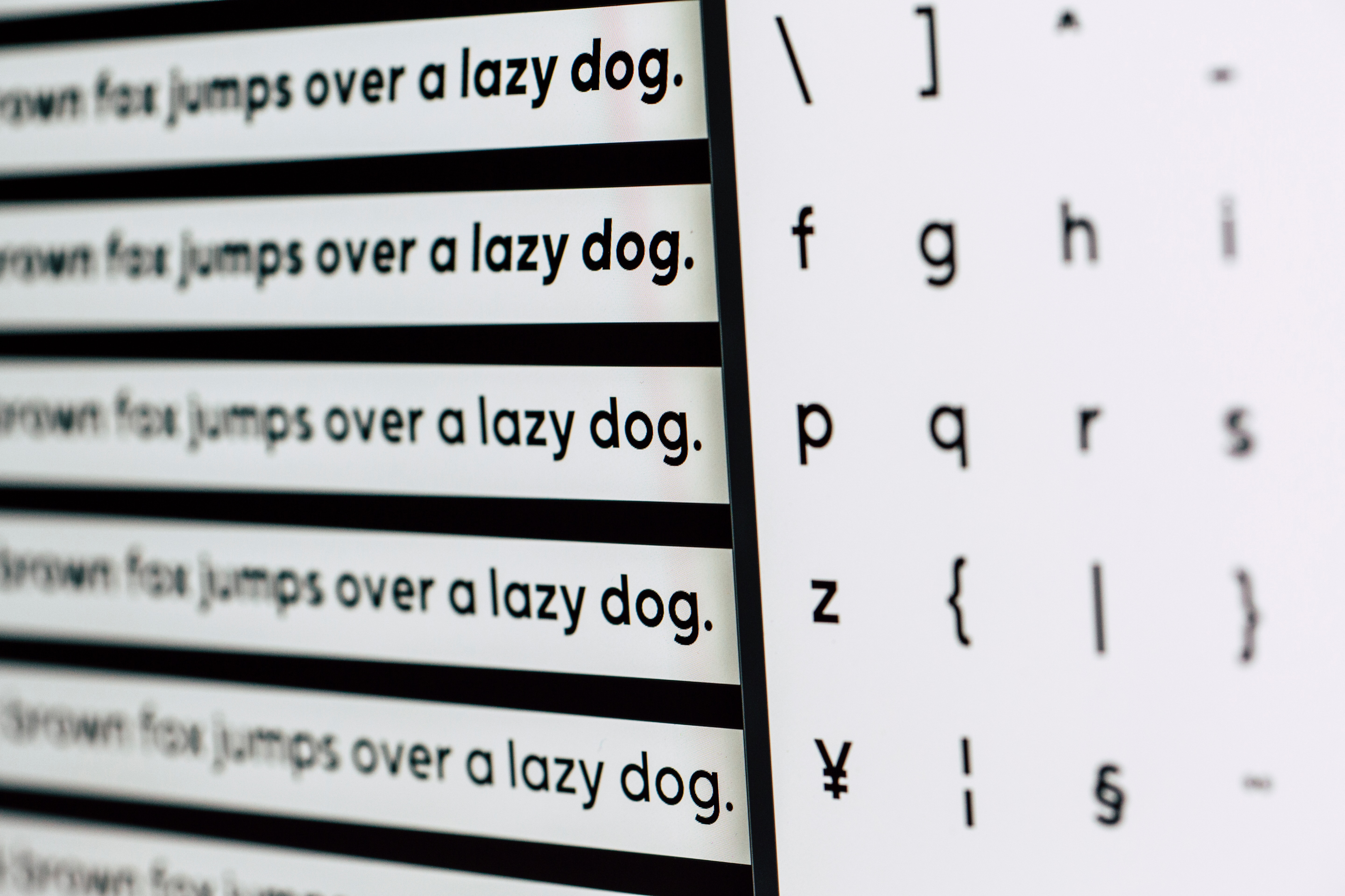
Legibility
Legibility is vital when it comes to font usage. If a consumer cannot read your content or has to strain in order to, there is no purpose in presenting it.
You can check the legibility of your selected font by examining each letter and writing a variety of words in it (‘The Quick Brown Fox Jumps Over A Lazy Dog’ is a great go-to!) You should also play around with text size to be sure it can be read in both small and large text.
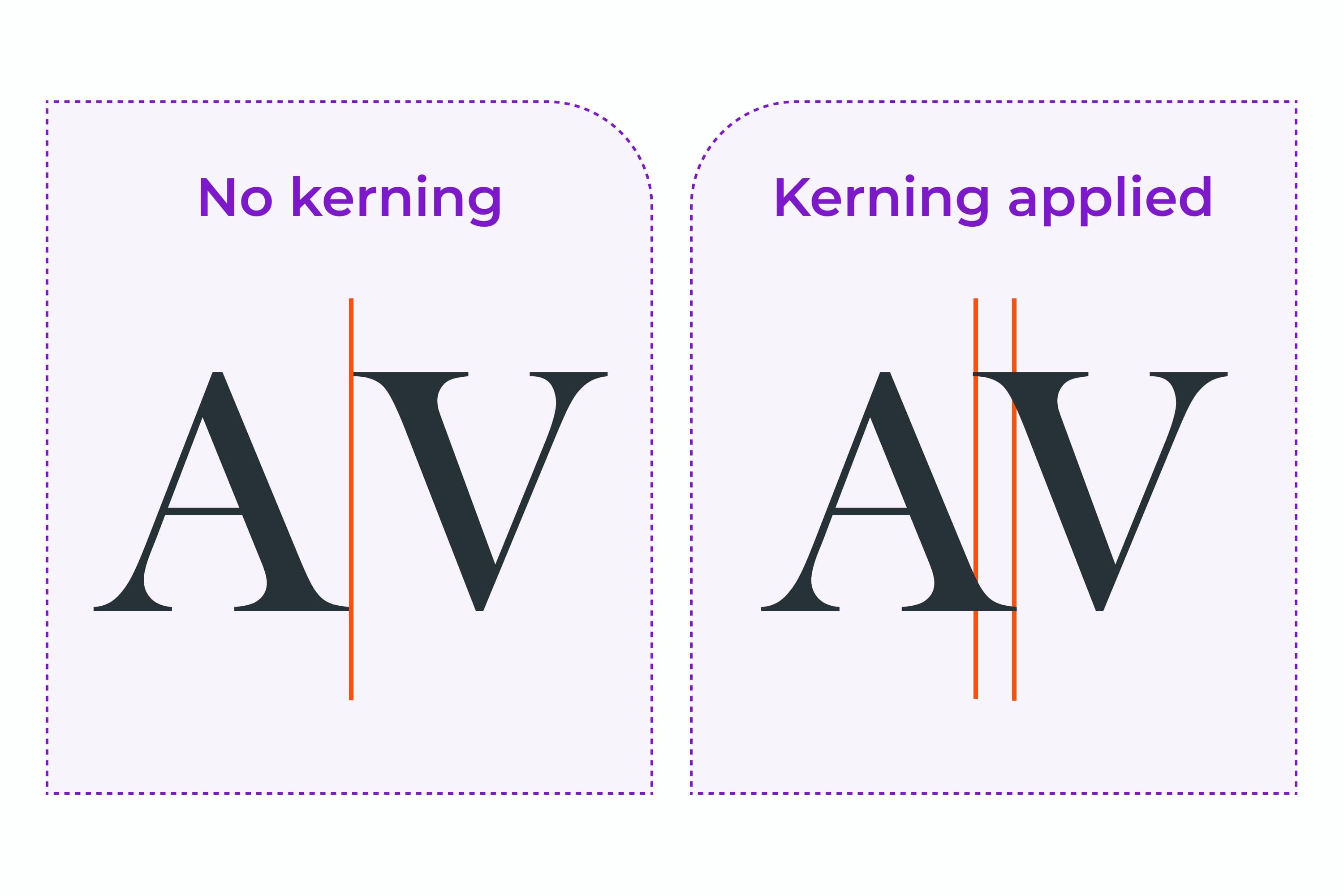
Kerning
Kerning refers to the space between two characters within a font. If a font’s characters are too tightly placed, it becomes illegible. If characters are too far apart, they can be confused with spaces.
When selecting a font, ensure the spacing allows for easy understanding of the text. Even kerning is also essential for a clean and consistent appearance.
Consistency
After selecting the most efficient and appropriate fonts for your company, be sure to use them consistently to ensure uniformity and cleanliness. A mess of varying fonts can be confusing, distracting, and irritating to a reader. It is also important to stay within the range of emotions you had hoped to evoke.
The Best Power Fonts to Choose From
With countless fonts out there to choose from, it can be challenging to determine which are most successful and best suited for you.
Luckily, we have narrowed down some of the best power fonts to elevate your branding. Here is our tried-and-true, alphabetized list:
A Pompadour
A Pompadour is a typeface that offers an elegant and retro feel, as it was inspired by vintage advertisements. It is easy to read in both its bold and script alternatives.
Akzidenz-Grotesk
This style is a wonderful choice for headlines on a brand’s website or advertisement and offers variability in weight. It is a clean, best-selling option for your branding.
Aleo
Aleo is a slab serif font with semi-rounded details and a sleek structure. It manages to have a strong personality while maintaining high readability. This will give your body copy its own unique style.
Anhattan
This script typeface is nostalgic and retro with a fun feel. It is youthful, eye-catching, and exciting. To grab the attention of a younger target audience, consider utilizing this font.
Armor
Armor is a bold and intense font. It has a very serious appeal and commands attention. This option would work well for a brand that wants to be seen as fierce and powerful.
Baro
Baro is an excellent font for combining your unique color and font selections. It allows easy color pairing in each layer and is sure to be loud, vibrant, and bold.

Baskerville
This font is a serif that was designed to improve the legibility of some Old Style typefaces. Baskerville is a great option to improve readability in your body copy.
Batik Worldwide
Batik Worldwide is compromised of simple and chunky lettering. It provides plenty of space to insert your own creative design or imaging within the letters for a personal touch that is sure to stand out.
Bison
This font is true to its name and was inspired by the animal to be sturdy and uncompromising in style. Its letterforms are controlled and contain a balance of hard lines and smooth curves. For an authoritative and reliable brand image, Bison is a wonderful option.
Black Spirit
Black Spirit is a cool, airbrushed display font. Resembling spray-painted letters, it has an edgy appeal. It is very personal in nature, emphasizing the humanity behind a brand.
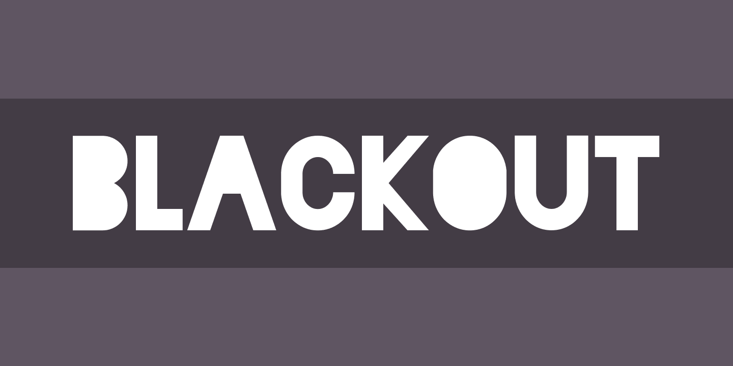
Blackout
This chunky, bold font is guaranteed to draw attention. Each gap is filled in, giving the text a serious and important quality. It also provides space for custom designs and imaging within.
Carlson
Carlson is a font that combines old and new styles of typography. It was influenced by Nuovo and contemporary art forms, giving it a modern and classy feel. This font may work well for a target audience of a wide age range, as it appeals to various eras.
Cosmoball
Cosmoball is a bold connected script font that has been known to “inspire a good smell and delicious taste.” It is simultaneously classy and fun. Many restaurants and food brands take advantage of this neat font.
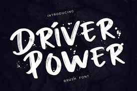
Driver Power
Similar to Black Spirit, this font is brushed and bold. It even contains drips that mimic spray paint or a paintbrush to complete its grungy feel.
Elevate Sans
This sans serif font is bold and heavy-weight, making it ideal for headlines, titles, or any text you hope to emphasize. It is one of the best bold fonts, without compromising readability.
FF Din
FF Din is the perfect typeface for a methodological, well-engineered, and industrial feel. This font would work best for a serious brand image or company in either the technology or engineering industry.
Flor Layered Font
This typeface is a beautiful one that is romantic, floral, and leafy. It is a surprisingly versatile font that would work well for many branding project themes: nature, romance, feminine retail, and childlike fairy-tale.

Flower Power
Flower Power is a beautiful and youthful option, heavily inspired by the ‘groovy’ vibe of the seventies. It has an elegant and stylish look that may best appeal to a young, feminine audience.

Fonseca Grande
If you close your eyes and imagine a postcard, you’re probably picturing the fun and bold letters of Fonseca Grande. It is a layered, retro font that is sure to evoke the feelings of excitement that are associated with travel.

Glamor
Glamor is chic, sophisticated, and modern font. It is recommended for headers and is sure to give your brand a trendy, elevated feel.
Have Heart
Have Heart is a beautiful marker-pen font of careful hand-lettering. It is both personalized and classy, perfect for fostering a connection with a reader.
Helvetica
This style is a classic and modern one considered to be incredibly easy to read. After using one of the flashier fonts to grab the attention of a reader, Helvetica ensures they can read whatever you have drawn them to.
Hot Mess!
This font is irresistibly fun and unique. It is bold, brazen, and hand-brushed, adding a flair of fun personality. If your brand or target audience is loud and proud – this is the font for you.

Kristopher
Kristopher’s key feature is its array of customizable curve compositions and letter alternations. It can be classic or modern dependent upon the way you adapt it. This font is excellent for brands with a designer looking for a bit of creative freedom.
Luchador!
The creator of Luchador describes the font as “full of the weight, character and charisma of a Mexican Luchador wrestler”, making it perfect to build brand personality. It is both loud and enticing for a potential consumer.
Lufga
Lufga is a geometric sans-serif font with a twist. It contains unique characters that give it a touch of distinction while remaining sleek and modern. Most notably, the lowercase ‘g; and ‘u’ make it undeniably recognizable.
Matrice
This font was inspired by Grotesk typefaces from the early 20th century and offers a crisp and stylish option for headlines. It is bold, clean, and commands attention.
Neon Planet
Neon Planet is a font as striking as its fun name. It is both modern and futuristic, complete with capital letting that mimics neon signage and a complementary script. It is bright, loud, and sure to gain a reader’s attention.
Norwolk
Norwolk is a unique font sure to grab instant attention. Its intricate folk-inspired lettering and sharp edges are visually pleasing and evoke an artisanal vibe. This font would work exceptionally well for outdoorsy branding projects.

Peyo
Peyo is a playful, uppercase, and geometric font that works best for headlines, posters, and titles. It is welcoming and fun while remaining clean and legible.
Quirk
This extra bold font is stackable and full of personality. The untraditional, almost three-dimensional look of the style is very eye-catching and fun.

Realistic Theory
Another brush font, Realistic Theory, is strong and hand-drawn with eye-catching curves. It has an urban and powerful feel, as well as a strong personal touch to personalize your various projects.
Speakeasy
This font family was designed as a toolset for menus, liquor labels, coffees, and restaurants. It is extremely classy and would work well to elevate an exclusive, high-end brand or a branding project in the food industry.
The Bohemian Alchemist
The Bohemian Alchemist has a non-mainstream appeal influenced by Native American traditions and old pharmacy bottles. It works to add a retro, dirty art look. It would be excellent for an artsy, handmade brand identity.

Thunder
Thunder, just like its name, is bold and demands attention. It uses thick lettering to provide your brand with a strong visual voice. Big letter fonts such as this are great for making a statement.
Unleash
This style is a duo font with bold, clean caps beneath a handwritten script. It is both modern and edgy and offers heavy text emphasis.
Verdana
Verdana is a typical go-to font for web design and body copy due to its readability. It was created specifically for computer screens and works very well for large blocks of text. This font is extremely versatile, working well for any brand.
VVDS Pacifica
VVDS Pacifica was inspired by the American branding typography of the late 20th century. It is elegant, with a vintage and hand-drawn appeal. It would work exceptionally well for logo design.
Youth Power
Like its name, Youth Power is a fun font that appeals to a young audience. It is a brush script font in a combination of upper and lowercase letters, with an elegant feel.
Fonts to Avoid
Now that you are equipped with a master list of the best fonts for your marketing campaigns and design projects, it is important to know which fonts to avoid.
There are a few reasons you should steer clear of certain fonts. Many are overused and will allow your branding to blend right into the sea of other campaigns. Some of the most overused fonts in business include Comic Sans, Papyrus, and Arial.
You also want to avoid a font if it is imbalanced or difficult to read. The considerations mentioned above are always essential to have on your radar when evaluating a font; emotions, balance, legibility consistency, and kerning. Be sure your consumers are not straining to decipher your text and consider fonts that offer multilingual support.
Finally, avoid a font if it is too dull. Simple fonts work well for body copy and easy reading, but you should avoid boring your audience. Not all brands and fonts want to evoke the same feelings and associations, but they should all evoke something at the very least.
Powerful Fonts – The Bottom Line
There is no single best font that will create the perfect web design or marketing campaign for your brand. A font may be majorly successful for one brand and detrimental to another. Therefore, when selecting the perfect typography for you, be sure to keep your unique brand identity, history, and messaging in mind.
Contact us for further guidance on selecting the best fonts and design elements for your branding.